The 5-Second Homepage Test: Can Customers Tell What You Do?
A visitor decides whether your website is relevant in seconds. Use this practical test to find unclear messaging before it costs you leads.
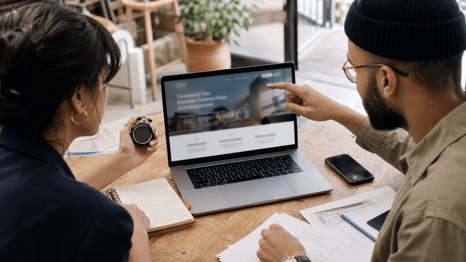
Your homepage gets five seconds before the first decision
A visitor lands on your site and immediately asks three questions: What does this company do? Is it for someone like me? What should I do next?
If the answers are not obvious, the visitor does not study the page. They leave.
That is why we use a simple five-second test before polishing animations, adding pages, or debating button colors. It exposes unclear positioning faster than a long design review.
How to run the test
Open your homepage on a phone. Hand it to someone who does not know your business. Let them look for five seconds, then hide the screen.
Ask them:
- What does the company sell?
- Who is it for?
- Where does it operate?
- Why should someone trust it?
- What should the visitor do next?
Do not explain the site or help them. Their first answer is the result.
The five things your first screen needs
1. A specific offer
“Solutions for modern businesses” could mean software, insurance, accounting, or office furniture. “Custom websites for New Jersey service businesses” cannot.
2. A recognizable customer
Naming the audience helps the right visitor self-select. A dentist, contractor, or startup founder should know within seconds that the page was written for them.
3. A meaningful outcome
Features describe what you make. Outcomes explain why it matters. “Fast, conversion-focused websites that turn local searches into calls” is stronger than “responsive web design.”
4. One clear action
Your primary button should make the next step predictable: “Get a website estimate,” “Book a strategy call,” or “Request a free audit.” Avoid vague labels such as “Learn more.”
5. Immediate proof
Add one compact trust signal near the top: a real client result, review count, recognizable credential, or service-area statement. Proof should reduce doubt, not create visual clutter.
What usually fails
The most common problem is an oversized slogan paired with a generic stock photo. It may look polished, but it makes the visitor do the positioning work.
Other failures include rotating carousels, multiple competing buttons, industry jargon, and headlines that describe the company instead of the customer's problem.
A homepage formula that works
Try this structure:
We help [specific customer] get [specific result] with [specific service].
Then support it with one sentence of context, one primary action, and one piece of proof.
For example: “We build fast, conversion-focused websites for New Jersey service businesses.” Follow with: “Launch with SEO foundations, lead capture, hosting, and ongoing care included.” Then offer a button to get an estimate.
Clear beats clever. Once a visitor understands the offer, strong design can build desire. Design cannot rescue an offer they never understood.
Want a second opinion? Send us your homepage and we will run the five-second test for free.
Mauricio Fernandez
Mauricio Fernandez is the founder of Minuswires. He builds custom websites for startups and growing businesses across NJ and NYC — each one running Brandlism, the growth-intelligence layer he built to get the site found, capture its enquiries, and keep improving it after launch.

Do I Need a Website If I Have Instagram? The Real Risks
Instagram is great for discovery, but it's rented space. Here's what social-only businesses risk — and the minimum viable site that fixes it.

Google Business Profile vs Website: What Each Does Best
GBP and your website aren't rivals — one wins local discovery, the other wins trust and conversion. Here's how to set up both so they work together.

Website Care Plan: What Is Included (And What's Not)
What should a website care plan actually include? Here's the anatomy of a legitimate plan — updates, backups, monitoring, edits, security — and the red flags in cheap…
One short field note a week.
What we shipped, what broke, what we'd do differently. Sent Thursday mornings. No spam, unsubscribe in one click.
Build a website that actually grows your business.
Custom websites, apps, and growth systems for startups, new businesses, and rebrands. Every project ships with Brandlism — the growth-intelligence layer that gets the site found, captures enquiries, and keeps improving it after launch.